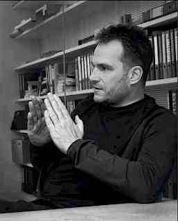
Andreas Cukrowicz in conversation
Thinking inside the box
Simple and unpretentious, not spectacular but rather thought-provokingly modest – this is the precept adopted by the Vorarlberg-based firm of architects Cukrowicz Nachbaur which also designed the corporate Head Office in Lauterach. Most recently the firm won the competition to design the new Concert Hall in Munich. In 2011, Andreas Uebele and his agency büro uebele designed the orientation system for the new trade fair center complex in Innsbruck – also in conjunction with Cukrowicz Nachbaur. Since then Cukrowicz and Uebele have not only maintained a productive partnership but also a close friendship.
Andreas Uebele: The Head Office almost seems to be suspended in mid-air. It’s like you’re a captain surveying everything from the bridge of a ship.
Andreas Cukrowicz: Exactly. And that’s how it should be. A position overlooking the action is ideal for a company Head Office. This way, you have a lot more surface area that needs to be insulated. And that doesn’t come cheap. But as always, the question is: Is something good value for money? What’s the return on my investment? When it comes to this building, I’d say: a whole lot. For this reason, we also opted for the square footprint. Squares convey a strong message and this looks equally imposing from every direction. That principle was the basis for everything else.
Gebrüder Weiss is an important player, not only because it is a local employer, but also because of its national and international reach. How can this status be crystallized in the architecture? Is some kind of elevation needed?
That’s a possibility. But it wouldn’t have worked in Lauterach, for planning reasons and because of the building’s physical environment. That’s why we devised another way of expressing the company’s significance: an expansiveness that conveys both size and a sense of confidence and composure. The fact that its space is spread across two floors reflects the flat hierarchies within the company. We understood the desire to encourage interaction between the employees – and that the boss should not be perched up on the 27th floor but rather be down with the other employees. That appealed to us a lot because it reflects our mindset. So, openness and expansiveness are major focuses. But at the same time we wanted to honor the basic human needs of the employees by not exposing them too much to the outside world. That is why we created this slatted facade. It offers a degree of privacy, intimacy. And it also produces some unexpected, architecturally interesting effects: the perspective from inside the building varies, revealing differing snapshots of the scenery outside.
The physical transparency created by the floor-to-ceiling glass is an interesting feature – especially for a company that is represented right across the planet and therefore wants to appear open and inviting. But what, then, made you opt for the matte black coloring?
We spent a very long time thinking about this and ultimately concluded that the Head Office should make a high-class impression. The black is understated but still very compelling – it resonates with the building’s rectangular shape. Maybe the shape and color are just a conventional combination, but it could also be that black is almost predestined for a square. Our feeling was that it should be black and not silver-gray. And even if we had gone for white, that wouldn’t have been cheaper. It would simply have looked cheaper.
The Gebrüder Weiss Head Office is at home in a region where tapping local skills and resources is paramount. Crafts are endemic in Bregenz Forest, as are principled attitudes and down-to-earth values. In the villages you can see the typical wooden houses covered with slats. How does your building fit into this tradition?
You can’t build a barn in a skyscraper or a skyscraper in a barn. We view this building neither in the tradition of rural buildings, nor in the organically evolving local traditions in craft and architecture. We see it as part of a qualitative attitude, of its local roots, and hence of a tradition on a different level. We place it in the context of the Upper Rhine Valley with its mounting urbanization. In just a few decades this area will give rise to a large city, a metropolitan region. Given that, I didn’t think of wood for Gebrüder Weiss. That wouldn’t have reflected the company’s line of work either. Instead we opted for a technical, sophisticated and honest structure that is something of a Pandora’s box, but in a very positive sense. It functions very efficiently – just like good logistics.
In logistics, what counts a lot is the most economical use of space. In this context, the generous proportions of the building don’t really seem to be a good fit, do they?
There’s no disputing that the building’s ground plan isn’t economical. If you wanted to create a really economical building, you would create two separate office zones divided by a two-meter wide corridor. Or even better, one that is one meter eighty wide. Then you attach a corrugated sheet facade which can be extended in any direction at any time. However, expanding the surface area opens up all kinds of pathways and spaces where people can linger. And if that is done well, it automatically generates added value in the form of communication options. If you have a long corridor, all you want to do is get from A to B and then back into your office. An environment with several navigation systems generates spontaneous and relaxed encounters, and these generate familiarity and promote communication. When people communicate, fewer mistakes occur; it acts as a springboard for innovation. And, ultimately, it’s the people that make the company.
For many years sustainability has been a key factor, both in architecture and in general debates, although the concept is actually 300 years old. Was it relevant to your work as well?
We are always discussing issues related to sustainability, with every building and every challenge we take on. But the problems we face are always different. It’s not as though we can simply take figures and compare them with existing calculations. Rather, our goal is always to ensure that the investment brings the greatest possible benefit to the greatest number of people. We want to create something that will last a long time, look good for a long time, and not require a constant stream of expensive repairs. For this reason we used high-quality materials that are robust and durable. Moreover, the building performs very well when it comes to costs. Despite its ample dimensions, it uses very little energy. And on the issue of arranging the individual offices, we found a system that allows us to respond very quickly to changing circumstances. That too is part and parcel of sustainable planning. An office can be reconfigured within a single day. Everything we need is already there. Whatever the future may hold, we will be ready.


When I visit my customers they often look to see which car I am driving. Because that’s obviously a statement in itself. In your view, does the same argument apply to architecture?
Ah, the Germans and their cars! (laughs). I’m a Volvo fan. They aren’t exactly cheap but they deliver sound value for money in their segment. What’s more, design has always been a real priority for Volvo, not that it is eye-catching and demands your attention. The design is as clean and timeless as possible, so that it still looks good twenty years later. That’s the way I want to build, too.
You mean, quite literally, un-fashionably?
Right. Not that trends should be eliminated completely from architecture. Two decades on we will likely be taking a different tack on design. Today’s buildings are statements of our time – but hopefully in ways that let them preserve their positives so that they won’t seem boring any time soon.
So you’re saying that in 100 years people will be able to say when approximately a building like the corporate Head Office was designed, just as we can tell nowadays that one was erected during the 1930s?
They will, yes. And I don’t necessarily believe that timelessness is a positive quality. It’s my conviction that everything can be a manifestation of its period. We are talking about contemporary design elements and presentation methods, and of course about the technical possibilities they demand. There are things that bear eloquent testimony to every era, and that’s how it should be.
But the term “timelessness” always has such positive connotations. People use it to describe a beauty that transcends trends and fashions.
I think there’s another dimension to this, by which I mean a desire to avoid something obtrusive – although it can still be product of its age. Because if you set out to create something that is valid for every era, you will soon run the risk of it becoming dull and dreary. Maybe you are simply avoiding the need to take a stance. For that reason, I have no fundamental objection to trends. For example, regionalism, a focus on tradition, is currently a hot topic in architecture. That’s a good thing in my mind, I am all for it. Plus, there’s another aspect: you can’t allow things to age gracefully, which is a strange phenomenon in and of itself. I think we need to become more aware of our transience and view our architectural surroundings in a similar light.
Working in graphic design as we do, we regularly get jobs that might be described as “no-frills” or streamlined, but which otherwise have little to offer – no history, no contextual positioning. The font used is then considered safe, for example Helvetica. The text is in black and left-aligned, and that all passes for “timeless.”
Exactly. In reality it’s simply trite.
But I assume there are also trends that you don’t approve of. For example, desk-sharing has been fashionable for some time, with offices built so that employees simply bring what they need in a container on wheels, and otherwise work wherever they want. What is your take on this? Don’t we need the personal touch – a cactus on our desks and family photos on the wall?
Look, employees are very important to us. They are all real people. When we are making appointments we look closely at candidates, first and foremost to see what type of people they are. In my view the trend towards providing maximum flexibility may be exciting from an entrepreneurial perspective, but from a human point of view I consider it dangerous and short-sighted. In my opinion, people need ways to identify with their workplaces that complement their personalities. I need to feel good about my workplace, if I am going to really throw myself into my work and duties. But if I don’t even have my own space, and things can be removed and replaced at any time, I start to feel that I too am interchangeable as a human being. And that idea sticks in my gullet. This also has further ramifications for my emotional bond with my company. My feelings towards it become similarly interchangeable. Personally, I like to have my son’s drawings close at hand. “For Daddy.”
Andreas Uebele is a communication designer who lectures in communication design at the University of Applied Sciences in Düsseldorf.